SVG transformations: translate,
rotate and scale
In the Primer, just three of the five classes of transormations that
can be used are actually discussed: translate, rotate and scale. There
are also skew transformations and matrix transformations as well,
though we will be discussing only the three that most authors are
likely to be interested in. Once armed with a knowledge of how these
three are used, however, the reader will be able to glean, directly
from the specification, how to use the others. You may be interested to
know that the SVG
working group is also considering as a part of its
development of SVG 2.0, other classes of transformations including non-affine
transforms that would enable distortions and perspective
effects as well. As a current working example displaying a hint of what
those richer transforms may allow, you may wish to take a look at this
example allowing the mouse to be used to simulate non-affine
transformations through the use of matrix transformations.
Translation:
First, the simplest of the transforms is translation. As one becomes
more familiar with SVG, its usefulness may become more apparent, but
already we can see an obvious use: we have a shape that is fairly
complex:
 <path fill="#bbb" fill-rule="evenodd"
d="M  70,140 150,0 200,100  40,100 100,0 170,140  70,140"/>

 <path fill="#bbb" fill-rule="evenodd"
d="M 270,140 350,0 400,100 240,100 300,0 370,140 270,140"/>
|
 |
In order to make a
duplicate drawn to the right of this shape, we could either
add a number (in this case, 200) to each of the x-coordinates
as shown above.
Or we can use a translate=translate(200, 0) to accomplish the same thing.
 <path fill="#bbb" fill-rule="evenodd"
d="M 70,140 150,0 200,100 40,100 100,0 170,140 z"/>

 <path fill="#bbb" fill-rule="evenodd"
transform="translate(200,0)"
d="M 70,140 150,0 200,100 40,100 100,0 170,140 z"/>
|
|
Observe how much less time would be demanded of a developer to
simply add a transform attribute, rather than needing to manually
change all of the coordinate values of a complex path!
Rotation:
Perhaps the simplest demonstration of the utility of being able to rotate a curve can be shown with a simple ellipse.
While many of you may remember learning how to plot the coordinates of an ellipse in grade school algebra:
e(x - cx)2 + f(y - cy)2 = r2
it
was not until the third semester of calculus that many (at least in the
U.S.) learned how to use parametric equations and sinusoidal
substitutions to actually rotate that curve by, say, 30 degrees. That
is, the mathematics of such a fundamental operation as rotating an
ellipse would be beyond the skill of many programmers! The trigonometry
involved in rotating a rectangle, though tractable to most programmers,
is not necessarily a fun exercise!
In SVG you simply do the following to rotate an object by 30 degrees::
<ellipse cx="200" cy="200" rx="20" ry="100"
opacity=".6" fill="#faa" stroke="#806" stroke-width="4"/>
<ellipse cx="200" cy="200" rx="20" ry="100" transform="rotate(30,200,200)"
opacity=".6" fill="#faa" stroke="#806" stroke-width="4"/> | 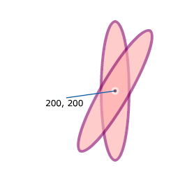 |
Scaling:
As
illustrated in the Primer, scaling may not be as intuitive as we might
think. That is, we often think of scaling as simply changing
something's size. However, the way scaling transformations are handled
in SVG is by multiplying each of the x and y coordinate values by some
constant. This will generally result in an apparent movement of the object away from the origin (0,0).
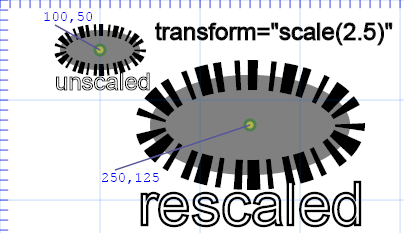
|
<ellipse

              cx="100" cy="50" rx="40" ry="20" fill="grey" stroke="black" stroke-width="12" stroke-dasharray="3,5,2"/>
|
<ellipse transform="scale(2.5)" cx="100" cy="50"
rx="40" ry="20" fill="grey" stroke="black" stroke-width="12"
stroke-dasharray="3,5,2"/> |
Let's close out this section with one more example exercise: trying to reverse-engineer the illustration below:
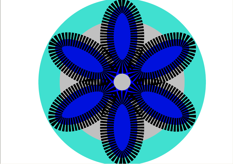
It is presented here in its actual size.
We
might first observe that the illustration appears not to be centered
(either vertically or horizontally) relative to the window. If it were,
this would tend to imply that coordinates had been specified as
relative coordinates like (50%, 35%). As is, we may, just as
conveniently, proceed on the assumption that the coordinates are in
pixel values.
[Hint: if we were concerned about matching the image exactly, we might
bring the above bitmap into SVG with the <img> tag and attempt to
match the dimensions exactly, or we could do something quite similar by
drawing atop the bitmap with Inkscape's drawing tools.]
The
foreground of the image appears to have six identical figures, all
rotated about a common center point that is just below the topmost of
the ellipses. The figures are probably ellipses with a dash-array.
Let's try to do one of those first. With a bit of experimentation, we
may end up with something like the following:
<ellipse cx="400" cy="120" rx="50" ry="100" stroke-dasharray="6,3" fill="#01d" stroke="black" stroke-width="45" />or even
<ellipse cx="500" cy="100" rx="40" ry="90" stroke-dasharray="5,3" fill="blue" stroke="black" stroke-width="40" />
Either would be considered good enough for our purposes in this class, I believe.
Since
there are six of these objects, we can calculate that each one will be
rotated 60 degrees (that is 360/6 ) more than the preceeding one, so
that the rotation angles will be 0, 60, 120, 180, 240 and 300
degrees. The point about which they are all rotated will have the same
cx value as the initial ellipse (let us use the top ellipse with cx
equal to 400.
We may play with diffferent values of the transform = rotate( ) command such as
transform="rotate(60, 400, 100)"
transform="rotate(60, 400, 160)"
or
transform="rotate(60, 400, 350)"
until we decide on a value of transform="rotate(60, 400, 270)" that "looks about right."
Completing the foreground of the picture can be, thusly approximated as
<ellipse  cx="400" cy="120" rx="50" ry="100" transform="rotate(60, 400, 270)"
stroke-dasharray="6,3" fill="#01d" stroke="black" stroke-width="45" />
<ellipse  cx="400" cy="120" rx="50" ry="100" transform="rotate(120, 400, 270)"
stroke-dasharray="6,3" fill="#01d" stroke="black" stroke-width="45" />
<ellipse  cx="400" cy="120" rx="50" ry="100" transform="rotate(180, 400, 270)"
stroke-dasharray="6,3" fill="#01d" stroke="black" stroke-width="45" />
<ellipse  cx="400" cy="120" rx="50" ry="100" transform="rotate(240, 400, 270)"
stroke-dasharray="6,3" fill="#01d" stroke="black" stroke-width="45" />
<ellipse  cx="400" cy="120" rx="50" ry="100" transform="rotate(300, 400, 270)"
stroke-dasharray="6,3" fill="#01d" stroke="black" stroke-width="45" />
The
remainder consists of two more circles centered about the same center
of rotation as the other figures namely (400, 200). Adding the
following two curves to the beginning of the file completes the picture:
<ellipse cx="400" cy="270" rx="240" ry="240" fill="silver" stroke="turquoise" stroke-width="70" />
<ellipse cx="400" cy="270" rx="50" ry="50" fill="none" stroke="blue" stroke-width="45" />
An example of the actual file used to generated this exercise can be seen here.