Case study: Drawing the letter M
Let
us begin with the point (100,200) move over and up to (200, 100) and
then over and back down to (300, 200). The d attribute of such a path
would be as shown here
<path d="M 100,200 200,100 300,200 " />
If
we include such code in a document, though, we would merely see a black
triangle, since by default, the fill value of drawn objects is 'black.'
If we turn off the fill as follows:
<path d="M 100,200 200,100 300,200 " fill="none" />
then
nothing will show up since the default value of the stroke is 'none.'
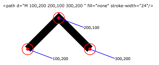
Adjusting both attributes at the same time makes the most sense:
<path d="M 100,200 200,100 300,200 " fill="none" stroke="black" stroke-width="24"/>
as shown in the illustration below:
We
are now part of the way to drawing something that looks like an M.
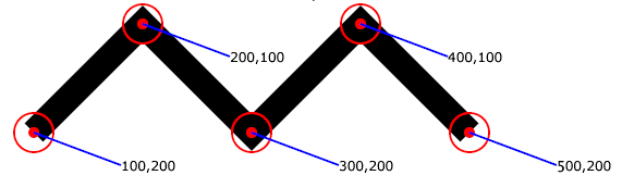
Another up and another down and we are getting closer!
<path d="M 100,200 200,100 300,200 400,100 500,200" fill="none" stroke="black" stroke-width="24"/>
Sure enough, as seen below, the path goes up and down like an 'M'!
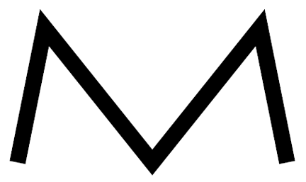
We
might observe, though, that this particular M is not quite like the M
most of us might visualize. First of all, an uppercase M typically has
its peaks closer to the end point than to the middle. This can be
accomplished by moving the 2nd pair further to the left (changing it
from (200,100) to (140, 100) for example) and moving the 4th point
further to the right (from (400,100) to say 460,100)). We might also
wish to expand the height of the shape, relative to its width.
<path d="M 100,300 140,100 300,300 460,100 500,300" fill="none" stroke="black" stroke-width="24"/>
The above path looks like this:
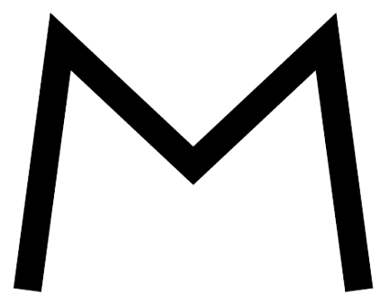
Still,
we might realize that the center of M's (at least in some fonts) is
sometimes higher than its feet (in this case it is a bit lower since
the stroke is centered about the defined point and the slopes of the
associated lines differ), so we might raise that a bit:, and perhaps
adjust the thickness of the stroke:
<path d="M 100,400 140,100 300,250 460,100 500,400" fill="none" stroke="black" stroke-width="34"/>
as is shown here:
Since
SVG allows the definition of one's own font, it would, in truth, be
possible to define a series of characters as path elements, though, in
truth, real world fonts as well as SVG's power for defining them are
far more sophisticated than this very simple example.

